A timeless icon with quirky style and intuitive design
Challenge
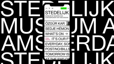
The Stedelijk Museum Amsterdam is renowned for its uniqueness, creativity, and playfulness. Our task? To create a new website “unlike any other museum website.” Together with the museum, we embraced a significant challenge: an artistic statement and a radically different website that remains accessible to everyone. How can one be both ‘distinctive’ and ‘unconventional’ without losing accessibility? We found the sweet spot in translating brutalism to the web and focusing on intuitive mobile-first design.
Result
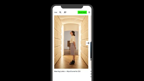
A bold statement that logically translates the museum’s typographic style and gives the museum a strong identity that is both commercially and artistically important. An intuitive and inclusive design puts the user first. Despite its original design and flexibility, this website from 2017 still feels brand new. A central search function enhances user convenience. Visitors can intuitively navigate and swipe through the museum’s collections. The chosen technology is the silent power behind the website. We created a super flexible content platform that can easily connect to new ticketing or data systems. Recently, we also quickly added the ‘campaign tag’ Unbubble.
What we did
Visual identity, design, digital strategy, accessibility
Impact
Awards
- European Design Award: Digital Identity
- European Design Award: Vernieuwde website
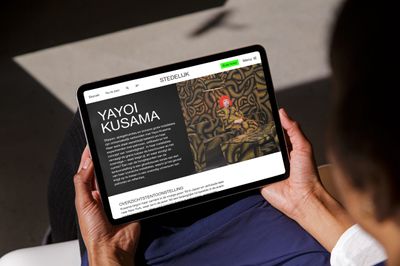
Experiments as a carrier of the DNA of Stedelijk Museum
In 1938, the Stedelijk Museum in Amsterdam was the first museum in the world to paint all walls white. In retrospect, it turned out to be the birth of the concept of White Cube; still the standard for museum galleries worldwide. This boldness and urge to innovate are still characteristic of the Stedelijk.
We gladly accepted the challenge to translate this creative DNA into a digital style and website. We launched the new digital style – and the technology behind it – in 2017. Due to the original and outspoken approach, the site is typically Stedelijk. And because we have not followed a trend, the website is still not outdated years after launch. And we are proud of that. Because a strong identity is not only important from an artistic point of view, but also from a business point of view.
Norday has had the courage to design a homepage that breaks with all design conventions. This is extra refreshing in this time wherein more and more sites seem to be based on the same wordpress template.
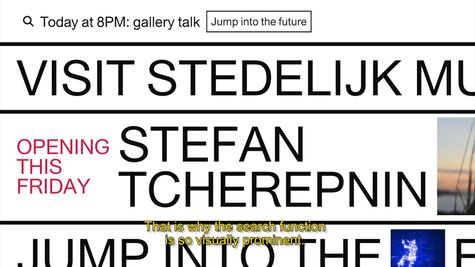
A bold statement with a focus on the user
A straightforward website is not suitable for a brand like Stedelijk. It was important for us to radically rethink what a museum website could look like. How the website could radiate creativity, daring and playfulness. But Norday always works user-centred, so a new mobile-first website also had to be very intuitive and inclusive. We found that combination of striking design and a new online experience for museum lovers.
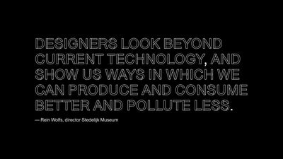
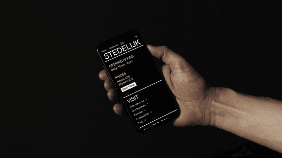
Brutalist Web Design
In terms of design, the web is becoming more and more uniform. Influenced by Google, Apple and Microsoft, designers are creating websites and apps with increasingly the same visual style. This feels familiar to users, but also leads to boring digital vineyards.
With the new Stedelijk website we wanted to make a bold statement and we brought the idea of web brutalism to the general public. Like its architectural predecessor, web brutalism is a response to standardization and exaggerated frills. In the past, brutalist architects such as Le Corbusier radically distanced themselves from ornaments on buildings. Digitally we see these ornaments as slick websites with an excess of images, while that does not always add much for users.
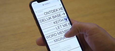
True to the corporate identity, but not the same
The Stedelijk Museum has an iconic, typographical identity by Mevis & Van Deursen. We translated that style into a form that makes sense online, without copying. In the digital style we developed, typography plays a major role, but also the element of play. We translated that playing with form into an interactive form by swiping the letters.
Brutalism refers to raw concrete (from the French “béton-brut”). We use typography as the raw concrete of the website. The texts are large and legible. Clear, but also so much in your face that it is an artistic statement.
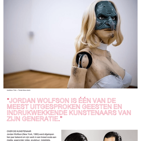
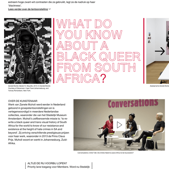
A website that is not standard, but intuitive
Many websites are actually digitized folders that you browse through. But we visit websites most of the times via our mobile and mainly use the search function to navigate. So it’s a lot more intuitive to focus on these functions – as happens in your mobile operating system and in chat apps. And it’s a lot more playful too. That was the inspiration for the design of the new Stedelijk website. Now it becomes fun to lose yourself in the online collection.
Tech as a driving force
As always, the technology behind what you see is a lot more complex. It is the invisible but driving force behind a good user experience for the public. But the website must also be user-friendly for the team. Behind the scenes, the Stedelijk site has a super flexible content platform that gives curators, conservators, scientists and marketers the tools to tell their story and archive it for the future.Both for scientific publications and to highlight something special from the collection to the public. And the technical systems of the collection archive, ticket sales and reservation systems are all smoothly linked to each other.
With our solution, new systems can be easily added or replaced. This way the website can continue to grow without any problems if there are issues that arise at a later stage. Without the need for a whole new system. This is how we make websites for the long term.

We do it together
The Norday team worked closely with the Stedelijk Museum team: Karin Sommerer, Robin Holland, Saskia du Bois and Moniek Dollekens.
In collaboration with Bas Koopmans (Art Direction), Koen Wijffelaars, Lotte Meijer, Maartje Rooker, Michiel Agterberg. In the research phase we worked together with SILO.
Thanks to the Stedelijk managing board, Karin van Gilst and Beatrix Ruf.
Ready to change things?

