Matching the right care to the needs of 20.000 Amsterdam citizens
The challenge
The healthcare sector must change rapidly. As the population ages, the demand for appropriate care is increasing, while there is a shortage of staff and resources. Cordaan, the largest healthcare organisation in Amsterdam, is facing this challenge. With 20,000 clients, each with unique care needs, the challenge is to efficiently guide these clients to the right teams for their specific care requirements. The new website needed to address this challenge while also reflecting Cordaan’s positioning.
The result
Through the new website, clients immediately understand where to go with their specific care needs and what services they can expect. With a carefully planned UX design, we present the most important information as clearly as possible, gradually introducing complexity only when necessary. Support is just one click away for all Amsterdam residents, including groups like caregivers, whose roles are expected to grow in the coming years.
What we did
Digital Strategy, corporate website, customer journeys, visual identity, UX design, development
Impact
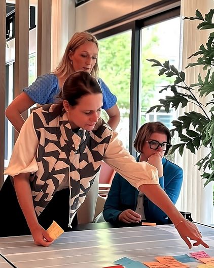
Customer journeys
Cordaan serves a large and diverse group of users in Amsterdam, from elderly care to day activities for people with disabilities, from youth care to home care for rehabilitation. Together with Cordaan’s teams, we mapped out the customer journeys of the largest target groups to determine how the website could best support them with their care needs.
Help where possible, care where needed
To make Cordaan’s care future-proof, the organization aims to make a clearer distinction between care and wellbeing questions in the coming years, providing care where it’s really needed and help where possible. The website also provides tools for managing expectations, such as clarifying who is responsible for what or what steps a client can expect next. This is presented in easy-to-understand step-by-step plans and expandable menus with practical information.
Matching needs with the right services
For many clients, as well as family members and caregivers, the Cordaan website is the first point of contact. Their questions are often specific and sometimes complicated. The healthcare world uses a lot of jargon, and many people are unsure of where to go or what their question is exactly.
The website is designed to prevent caregivers, professionals, referrers, and clients from getting lost in the offerings or going to the wrong place. We achieve this by providing clarity as quickly as possible and ensuring they find the right place. With clear entry points for each target group, we clarify the path to appropriate care. Input for this came from a concept sprint in which we, together with a broad representation from Cordaan, mapped out the customer journey to gain insights into how best to guide visitors in answering their (care) questions. The website provides step-by-step relevant information and helps clients refine their care questions, with explanations or support available at the click of a button.
The conversations, workshops, and sprints with the team at Norday were enriching and, above all, enjoyable. Together, we found a good balance between strict requirements and the necessary flexibility to achieve our goal: a fantastic new website for Cordaan.
Colourful and meaningful, together
Cordaan is an innovative care organisation with a deeply rooted network in Amsterdam and several locations just outside the city. Equality between care professionals, informal carers, and clients is one of Cordaan’s core values. Everyone is allowed to be themselves. This is evident in the internal culture and the care Cordaan provides and organises for its clients.
The existing visual identity has been refreshed for the new website. We made the style more modern and accessible while retaining recognisability.
Visual content strategy
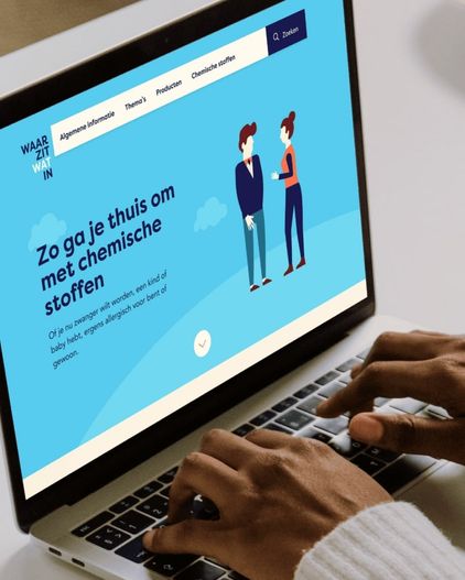
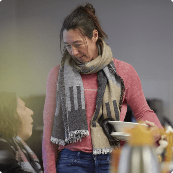
Equality and a human approach were also key principles in translating the visual identity to the website. Therefore, we chose images that show care providers and clients interacting spontaneously. Vulnerability is allowed, but the focus is on strength and positive emotions. In some cases, it is not clear who is the caregiver and who is the client, and that is the intention. Illustrations clarify processes and concepts, while fixed colours help identify certain areas and functional blocks, such as the contact section.
Care that is accessible to everyone
Cordaan has a broad reach within Amsterdam, serving people who may face various challenges. A technically accessible site is a given, but it’s just the start. Our principle is that every website should be equally usable for everyone and provide an equivalent experience.
We tested the concept with Buro ErvaringsKracht, a panel of experts with mild intellectual disabilities. They provided valuable insights, such as the importance of avoiding pages that are too easy to skim, as the target group prefers to read everything from A to Z to ensure clarity. They also emphasized avoiding similar terms like “treatment” and “guidance” close to each other to prevent confusion.
Room for innovation
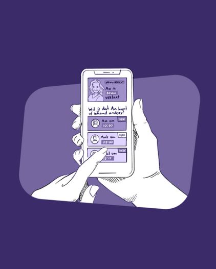
The website is a flexible platform that allows for integration with various (digital) care innovations that Cordaan is developing. The website provides access to ‘My Cordaan,’ where various tools are now available and will be in the near future.
Ready to change things?