An inclusive platform for equal opportunities for children

Challenge
Children rely on their parents or guardians to choose a suitable daycare or school. This can be a significant challenge for some parents because they are unfamiliar with the school system and may face barriers due to their educational level or cultural background. To combat inequality, it is crucial that all parents can find and understand the right information. Therefore, the municipality of Amsterdam asked Norday to develop an accessible digital platform that provides clear information about the registration process, the school system, and school performance.
Result
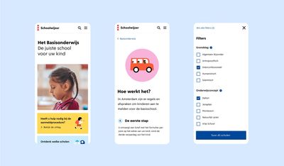
The Schoolwijzer website is user-friendly and accessible, ensuring no one is excluded based on skills or background. Government sites often overwhelm users by presenting all information at once, causing users to lose track, especially if they are not used to such texts.
To understand the needs of our target audience, we conducted user research. This revealed that a balance is needed between explaining and omitting information. Therefore, the page only shows the information relevant to the current step.
Through interim quick scans and audits, we ensured accessibility at every step on the website. And successfully: 25% of all Amsterdam residents use Schoolwijzer, which is twice the number of school-going children in Amsterdam.
What we did
Service design, Digital strategy, accessibility, customer journeys, visual identity
Impact
Children don’t all have the same opportunities, and education plays a significant role in this inequality. The City of Amsterdam is actively working to address educational inequality through policy initiatives. The online platform Schoolwijzer plays a big role in this effort by assisting parents in selecting the right school for their child. It provides clear information about the application process, the educational system, and the performance of all Amsterdam-based primary and secondary schools, as well as childcare facilities. By doing so, the site contributes to levelling the playing field for all parents, regardless of their educational background or cultural heritage, ensuring that every child has a fair chance of accessing the school that suits them best.
The fact that the number of unique visitors is twice the number of school-aged children in Amsterdam indicates that the site is truly utilized by a broad audience. That is why accessibility and inclusivity were top priorities in our approach, content, technology, and design of the Schoolwijzer site. We are experts in creating inclusive websites, but we took it a step further when creating Schoolwijzer. It is customary for a government website to undergo an external audit to check if it complies with the Web Content Accessibility Guidelines (WCAG) when it is nearly finished. However, with Schoolwijzer, we incorporated accessibility and user testing early on in the creative process so that we could make inclusive decisions at every step.
The power of continuity in collaboration
We were familiar with the site because we developed it in 2013 on behalf of the City of Amsterdam. In fact, we were even involved in its predecessor, the Quality Guide, as early as 2012. This long-standing collaboration has numerous advantages: we have a deep understanding of the content and context, which helps us deliver a high-quality product quickly and it enables us to play a connecting role in stakeholder management.
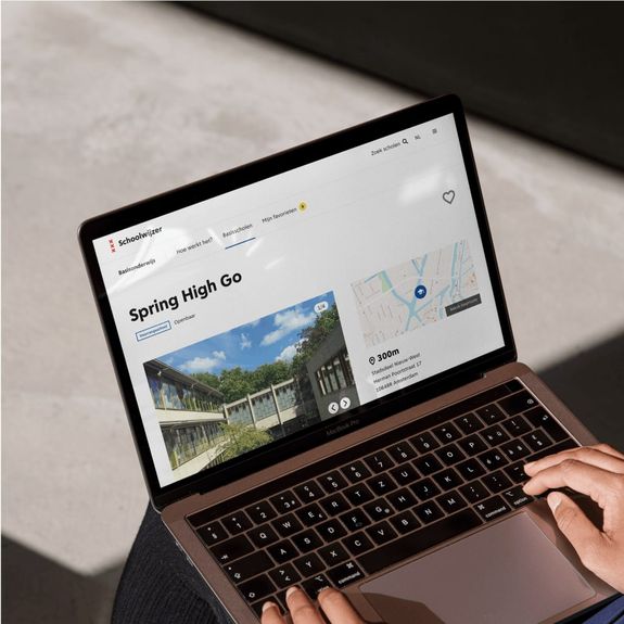
Presenting information in a clear and organized manner
How do you ensure that all parents have equal access to information to make an informed decision about their child’s schooling? This involves considering both sides of the following contradiction: providing all information versus keeping a clear overview.
Starting with the first aspect: on the website, all schools should be easy to find and searchable. And to create an even playing field, it’s important never to assume that users already have prior knowledge. With every strategic decision, we therefore ask ourselves: what if you’re doing this as a parent for the first time and aren’t familiar with the school system? Clear explanations about the school and enrollment system are just as important as a clear overview of schools. We ensure that terms are explained and even clarify why certain information is relevant to making a good school choice.
And now we come to the second part: creating a clear overview of all the information. Often, on government websites, all information is lumped together, making it difficult to navigate, especially if you’re not used to reading this type of text. That’s why we don’t display all information on one page but only show the information relevant to the step you’re currently on.
We ensure inclusivity in Schoolwijzer by:
- Creating an overview: We carefully prioritize which information is most important. As a result, each page has a clear message, and the information remains organized. Terms and concepts are explained in an overlay, so you don’t leave the page you’re on, and you don’t get lost.
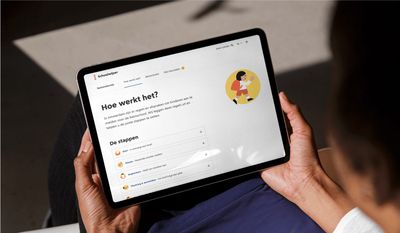
- Guiding people: The site guides you through the process in simple steps. These steps are supplemented with concrete tips, such as “3 follow-up steps if interested in this school.”
- Visualizing research data: The results are made intuitively understandable through visualization. By representing complex weighting factors as shapes, colors, and sizes, readability is significantly improved. Also, it creates a friendlier user experience.
A warm design within the municipality's branding
Schoolwijzer is a Government website. While focusing on content is crucial, it’s also important to ensure that users have a pleasant experience. In the design, there is enough white space, which contributes to a sense of calm and clarity. Through photography and illustrations, we add colour, giving the site warmth and vitality, all within the guidelines of the Government of Amsterdam’s branding.
An inclusive approach
Due to our expertise in inclusivity, we design and develop with accessibility in mind from the outset. But with this project, we went even further. Normally, a site is audited for WCAG compliance afterward to assess its usability for people with disabilities. However, we strive for an equal user experience. That’s why we integrated quick scans into our creative process. At an early stage, we had the independent agency SWINK review the concept, design, content, and technology so we could design and build for broad accessibility optimally.
For example, they carefully examined the sequence of all elements on a page: Is the order logical when navigating through the page using a keyboard? And have we given clear names to all elements in the code, which are read out loud by a screen reader for visually impaired users, making it clear what to expect? So instead of ‘more information’ in the code, it says ‘more information about Montessori education’.
Reliable and future-proof tech
techniques to make management much easier—after all, there are many schools and officials who need to maintain parts of the site. By smartly linking with internal and external systems, website management is automated as much as possible. We use government data sources (such as the list of schools, judgments of the Education Inspection, student numbers) to keep the content up-to-date. It’s convenient and reduces the chance of human errors.
With our solution, new systems can be easily added or replaced. This allows the website to continue growing seamlessly if there are issues that arise at a later stage. Without the need for an entirely new system. This is how we create websites for the long term.
Ready to change things?

